Hi - can you tell me how I can create a bar chart with two y axes, e.g. no. of sales and sale value by sale channel.
Thanks
1 Like
Hi there,
Thank you for reaching out!
Currently, Ragic’s bar chart tool does not support dual Y-axes in a single chart. I understand that being able to compare Number of Sales (Count) and Sale Value (Currency) side-by-side across your sales channels would provide great insights into your channel performance.
To help our product team better evaluate the possibility of supporting this feature in the future, could you please share a bit more about your specific use case? For example: How would this comparison specifically help you in your daily decision-making?
Your feedback is very valuable to us as we continue to improve Ragic!
1 Like
Hi
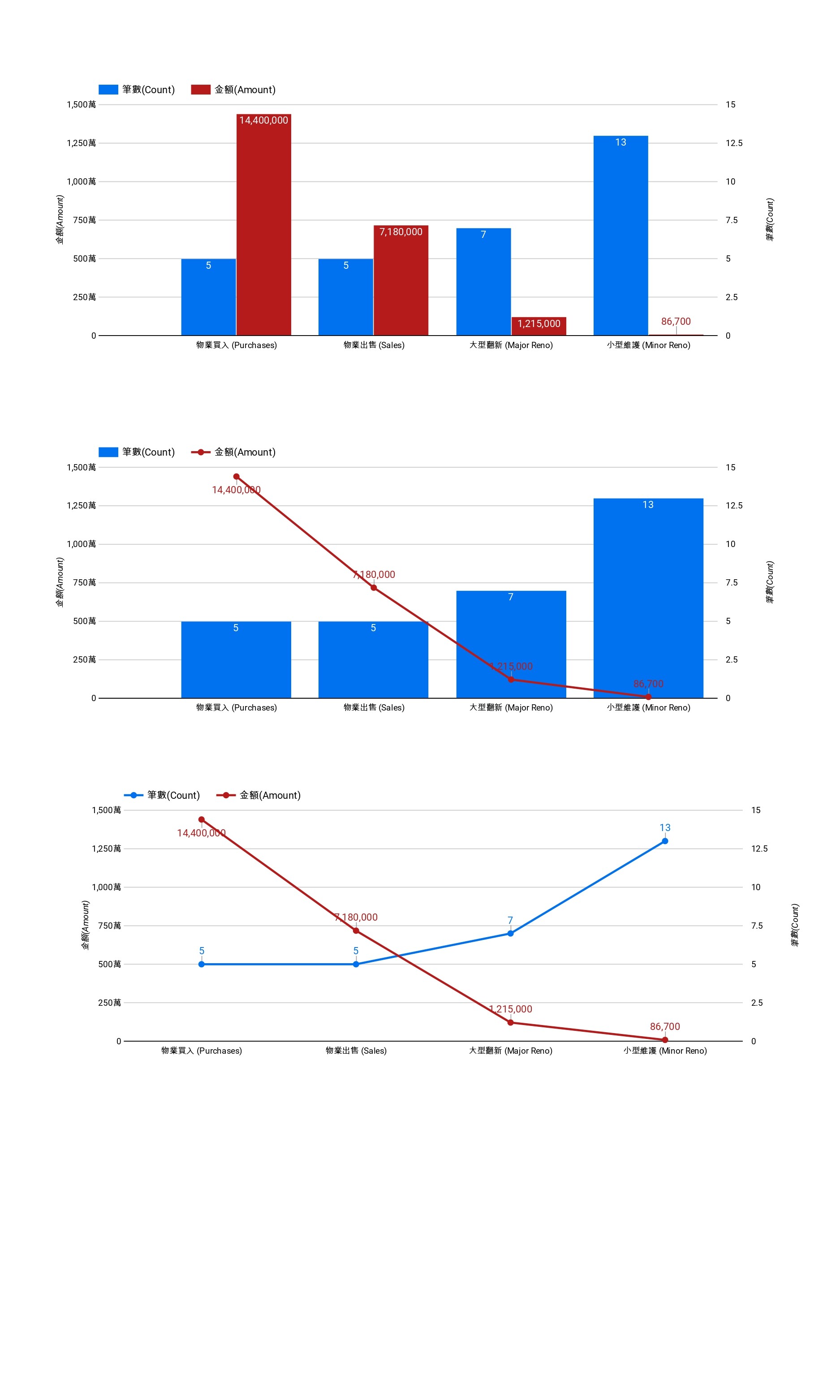
The actual use relates to property transactions, where we would like to monitor the number and associated value of different transaction types. This helps us understand what the property owners are up to. For instance, are they selling or buying or renovating - and what sort of values are involved. Are the renovations major or minor?
Cheers
Hi,
Thank you for sharing those details! Your use case regarding property transactions is a great example of why comparing transaction volume and total value on a single chart is so valuable for market analysis.
I have officially recorded this as a feature request and shared your feedback with our product team for further evaluation. While we cannot promise a specific timeline at this stage, we genuinely value these insights as they help us prioritize future enhancements.
We will share an update on this thread if this feature becomes available. Thanks for helping us improve Ragic!
1 Like